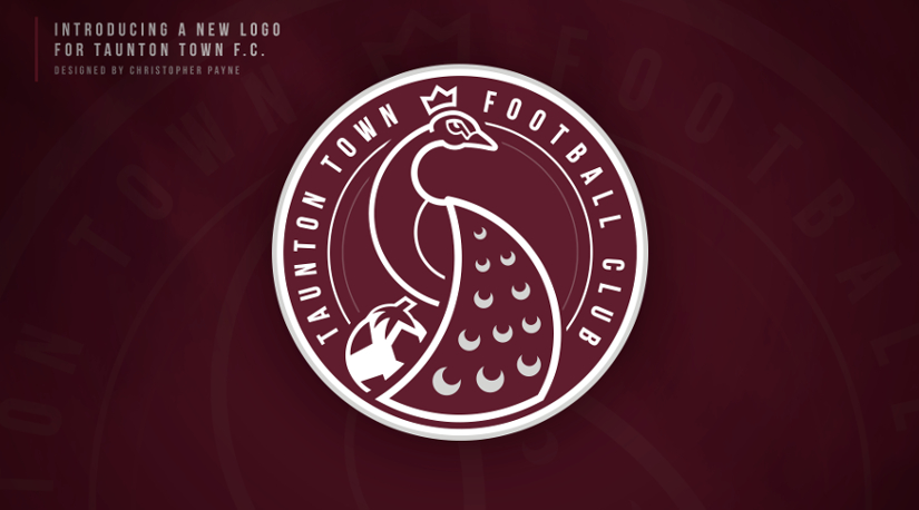
Taunton Town Football Club in partnership with football logo designer Christopher Payne, are delighted to reveal the club’s new crest with immediate effect.
Following the most successful two years of the Peacock’s history, reaching the First Round Proper of both the FA Cup and FA Trophy and clinching the Southern League West title, the board wanted to build on these successes and recent commercial growth by creating a new brand to further reach its ambitions of National League football and beyond.
Marketing and Communications Director Giuseppe Fraschini remarked: “The new club emblem proudly displays a peacock at the heart of its design and is instantly recognisable. Unless you really know about the town of Taunton and its historic crest, you may not understand what it represents. Our new design gives us an identity that our supporters can truly be proud of and the club is indebted to Chris who undertook this challenge with passion and dedication. He spent months researching and understanding the character of our club and town and has produced a beautiful modern design. I’m really looking forward to working with Chris and taking our club to the next level”.
The new crest was first revealed in public via a specially produced video at last night’s Champions Dinner and was created by British graphic designer Christopher Payne who is based in the USA and has carried out similar work for other clubs including Alfreton Town. He commented: ”The club’s progress over recent years and desire to keep progressing and keep improving in all areas was what attracted me to this project. Working with Giuseppe and Kevin and the rest of the people behind the scenes at Taunton Town FC was great and it is a massive honour to play my part in the history of this football club.” Elaborating on the rationale behind the redesign, he continued: ”The board realises that ambitious football clubs can’t stand still, they must evolve with the times and constantly look to progress in all areas, and that drive and desire to better the football club was evident in all interactions that I had with the club. A football club’s logo needs to be adaptable across many different use cases and scenarios, and whist I understand that the original logo served the club well for many years, there were many use cases where the original logo didn’t work. This new design stands out when used on all use cases, from club merchandising, to stadium signage, kit design, print advertisements, and particularly digital screens such as TV’s and mobile devices, just to name a few. The new logo is modern and stylish and clearly tells the viewer who and what it represents. It will provide the football club with solid foundations to progress the brand and move forward in the modern era”.
The new Peacocks’ logo will now be in place for the team’s first season at Step 3 of the non-league system, opportune timing for Chairman Kevin Sturmey who concluded: “This shows how far we have come as a club in the last two years. Zeppi (Marketing & Communications Director) felt we needed to modernise our badge to which the Board agreed, and he set about finding a designer. We are indebted to the work done by Christopher. I think it shows not only what we have achieved but it’s also just the start of our journey. Tradition is great but we all must move with the times and you must constantly modernise tradition to engage with our community and keep attracting new as well as younger fans. Expectation is normal for young people these days and we need to keep progressing on and off the pitch as the world will not slow down and we must try to keep ahead of the game.”
